Settings.app
After decades without a redesign, System Preferences on macOS gets a bold & beautiful new look.
Everyone has a thing in their life long overdue for a change. It might be a piece of clothing that you're convinced still looks good on you or that pickup line that's more sleaze than smooth. For macOS, it needs to admit that settings... I mean... System Preferences is long (LONG!) overdue for an overhaul. Like insisting, against all evidence, that your favourite pair of jeans still fit, it's time to face the fact that you've outgrown what you've got and move on.
System Preferences
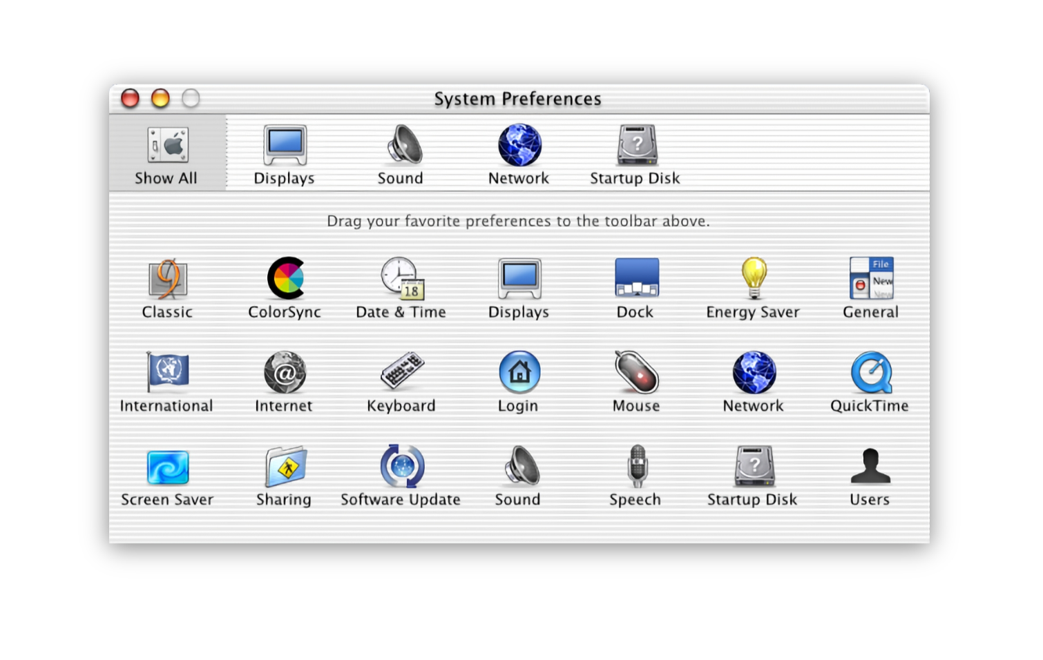
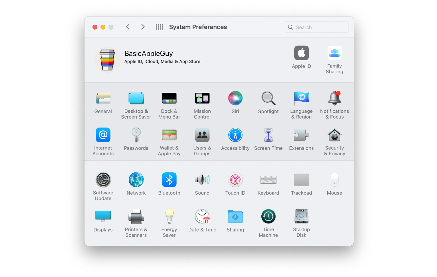
System Preferences has gone decades without a redesign, appearing noticeably unchanged as macOS has evolved around it. Pictured above is System Preferences from Mac OS X 10.0 in 2001 (Photo Credit: Stephen Hackett) contrasted with System Preferences from macOS 12 in 2021.
System Preferences has been around from the earliest days of Mac OS X. A side-by-side comparison of the System Preferences from over two decades ago to the System Preferences of macOS Monterey will instantly create the reaction that the two look shockingly alike. Many of the same categories - from General to Sharing, Network to Startup Disk - are faithfully preserved in macOS Monterey much like they were in Mac OS X 10.0 back in 2000. It's actually quite remarkable that a program in the modern era can survive for so long in such a preserved state.
What's Wrong with that?
To argue that System Preferences needs to be changed suggests something wrong with it in the first place. And for an app as critical to the operating system as System Preferences, there is risk in overhauling the application. While things are periodically added to the preference pane, it functions and looks very much as it did decades ago, and generally speaking, that works fine enough.
My Beef With System Preferences
But my frustrations with System Preferences are that features are continuously being crammed into a format that has outgrown its utility, and that the current System Preferences continue to diverge significantly from Settings on iOS.
As features have continued being added to macOS, Apple has opted to force new preferences inside existing ones to avoid icon overcrowding. Focus Mode on iOS is crammed into the new 'Notifications & Focus' tab on macOS, Night Shift is a tiny button on the bottom right under the Display settings, and the Control Centre is managed behind the 'Dock & Menu Bar' icon through a process of having the user individually click-through 15+ different tabs to customize their Menu Bar.
And while some settings are crammed together, others feel needlessly scattered. AppleID, Family Sharing, Internet Accounts, & Users & Groups are four different preference icons, while on iOS they are essentially all managed under a single tab. Showing the Bluetooth icon in the Menu Bar is done through the 'Bluetooth' settings, while changing the clock is done in the 'Dock & Menu Bar' settings, not the 'Date & Time' option.
My other main gripe with System Preferences is how differently it operates and looks relative to iOS. Yes... yes... I know iOS and the Mac are different, but whereas many apps have tried to create coherence between platforms, System Preferences stubbornly resists. Not only is there a significant icon mismatch between the two platforms at a time where macOS is adopting the design language of iOS, but similarly named items contain radically different things. For example, General on macOS houses everything from accent colours, light/dark mode appearance, and setting a default browser; whereas General on iOS houses software updates, AirDrop controls, iPhone storage, Date & Time, and more.
General settings between MacOS & iOS share no similarities despite both platforms having many of the same settings albeit in very different locations.
Furthering the mayhem, on the Mac, you'll need to go to multiple different locations to achieve what can be accomplished from one tab on iOS. Software updates require going to the 'Software Updates' icon in System Preferences, AirDrop settings are managed by going to Control Centre in the Menu bar, and managing storage requires you to go to the Apple Logo in the Menu bar, select "About this Mac", select "Storage" and select "manage...". Instead of a single setting pane like iOS, macOS scatters and buries these settings in dozens of distinct places across the OS.
And while Night Shift, True Tone, and Brightness settings can all be managed in the 'Display' setting on macOS and the 'Display & Brightness' tab on iOS, adjusting light/dark mode appearance is found separately under "General" on macOS. Why? I don't know. What at first glance looks like complexity begins to feel more like chaos and a lack of coherence. And as Steve would say, "there has to be a better way."
A Better Way
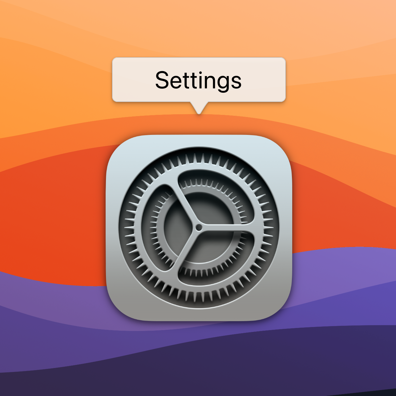
Introducing the redesigned Settings app for macOS.
I'll be the first to call out that my few mockups of System Preferences are just an initial take to address some of my frustrations with the application. It by no means solves all annoyances and may conceivably create more problems than it solves, but let us take a look at some initial reimaginings of a redesigned Settings app. I wanted the new Settings app to have coherence across all menu options. In its current incarnation, preferences like 'General' look and function very differently than a more recent preference like 'Trackpad' or an even newer window like 'TouchID' or 'Apple ID'. A redesigned Settings app could modernize and simplify many legacy preferences with a fit and finish more at home to modern macOS.
New Name: Settings
New look, new name. System Preferences is now Settings on macOS.
Let us start by creating coherence between platforms. It's settings on iPadOS, iOS, watchOS, and tvOS; now, it's Settings on macOS as well.
Sidebar
The new settings layout features a sidebar with all the setting areas on a scrollable panel that expands to the right. The feature modernizes the app's look & is modelled after iOS, bringing consistency across platforms.
I've mocked up the Settings window to feature a sidebar of categories on the left that expands out to options on the right, just like on iOS. The icons and layout have been modernized and brought closer to what users are familiar with on Apple's other platforms. Users can utilize the search bar on the top left to narrow down items or scroll through rearranged categories featuring iconography borrowed from iOS.
Sidebar icons are simplified using SF Symbols, aligning them with established conventions across macOS & iOS and modernizing their appearance.
About this Mac
All your software, AppleCare, storage, & subscription management can all now be done inside the ‘About This Mac’ tab inside redesigned Settings app.
Software updates, storage, and subscription management are currently scattered across multiple settings and tabs across macOS. A new 'About This Mac' pane has been added to the top of Settings to give users at-a-glance information about their storage, updates, and AppleCare from a single window.
Desktop Settings
The new Settings app arranges settings into more coherent categories. Inside Desktop Settings, all the features are laid out in a single scrollable window instead of buried behind multiple System Preferences icons.
I've merged items from multiple system preferences (General, Desktop & Screen Saver, Displays) into a single unified 'Desktop Settings' pane. Users can change all aspects of their display from one panel rather than adjusting the brightness in one location, setting dark mode in another, and wallpapers in a third location. macOS has matured enough that a unified Desktop Settings panel to house all aspects of the desktop experience is more efficient than having these features crammed into legacy categories.
Bluetooth
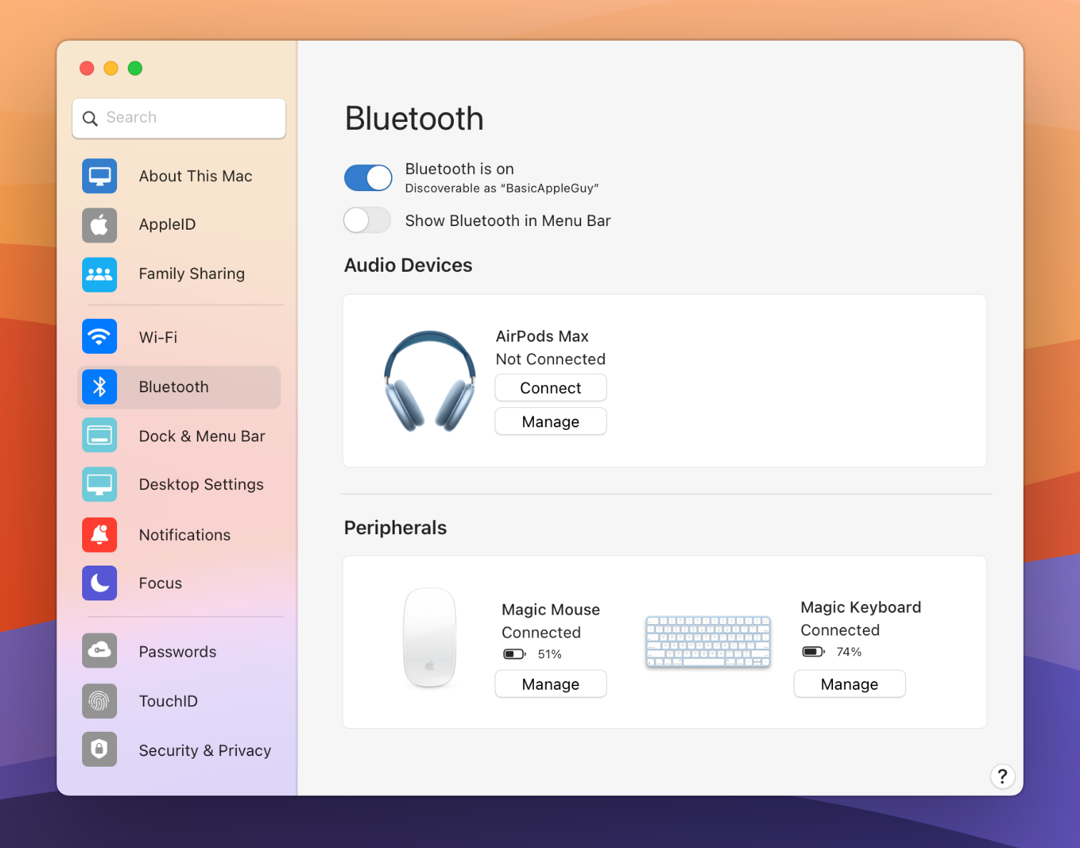
A modernized Bluetooth panel inside Settings adds more controls and a cleaner UI for displaying & managing Bluetooth devices.
The new Bluetooth panel is less radically reconfigured, although it has been upgraded to feature a more modern UI. Information about connected devices is categorized, featuring large icons highlighting the device and its status with options to connect or manage the accessory from inside the app. This mockup was created specifically to highlight what a refreshed UI could do to improve the experience and interactivity of an essentially unchanged setting.
In Sum
Rebuilding an app as critical as Settings on macOS would be ambitious. But done carefully, it has the potential to modernize, accentuate, and clarify the capabilities of macOS.


