Landscape Home Screen
Reimagining the return of a native landscape orientation to the iPhone.
In August 2022, I began playing around with the concept of landscape mode returning to the iPhone Home Screen (If you owned an iPhone 6-8 Plus, you might remember this orientation option). And when I saw @aaple_lab post his iOS 17 concept that featured a landscape orientation, I 1) was very impressed at the quality of his work and 2) wanted to kick myself in the ass for not finishing and releasing my concept earlier.
But his post inspired me to return to the project and add the finishing touches to the mockup I began last year. Now finished, I still wanted to share it for the sake of it. Enjoy.
History
When Apple released the iPhone 6 & 6 Plus in 2014, it introduced the ability for the Home Screen on the larger 5.5-inch Plus iPhones to be rotated 90º and used in landscape orientation. The dock icons would stay a the right and become a vertical column of icons, while the other icons on the Home Screen would reorganize into six-icon-wide rows. In addition, many apps would expand to show more columns and content when the iPhone was in landscape orientation:
Mail and Notes would show mailboxes and folders to the left.
Calendar would show a week's view of events.
Messages would show a column with other contacts adjacent to the current message window.
Even the keyboard would extend to a widescreen format for easier typing, though with it taking up the lower half the display; its utility was suspect.
The feature never really caught on. Most people, even those with larger phones, prefer interacting with the iPhones in a portrait orientation most of the time. And apps that saw substantial updates (e.g., News, Reminders, Stocks, Weather) began abandoning this feature over time, with only a handful of Apple iPhone apps retaining any significant landscape functionality (Mail, Notes, Safari, and Settings still having vestiges of an actual landscape mode). The landscape Home Screen disappeared on iPhones with the introduction of Face ID, though it continues to be supported in older Plus iPhones even until, I believe, the current version of iOS 16.
Landscape Mode
Reintroducing Landscape Mode on iPhone.
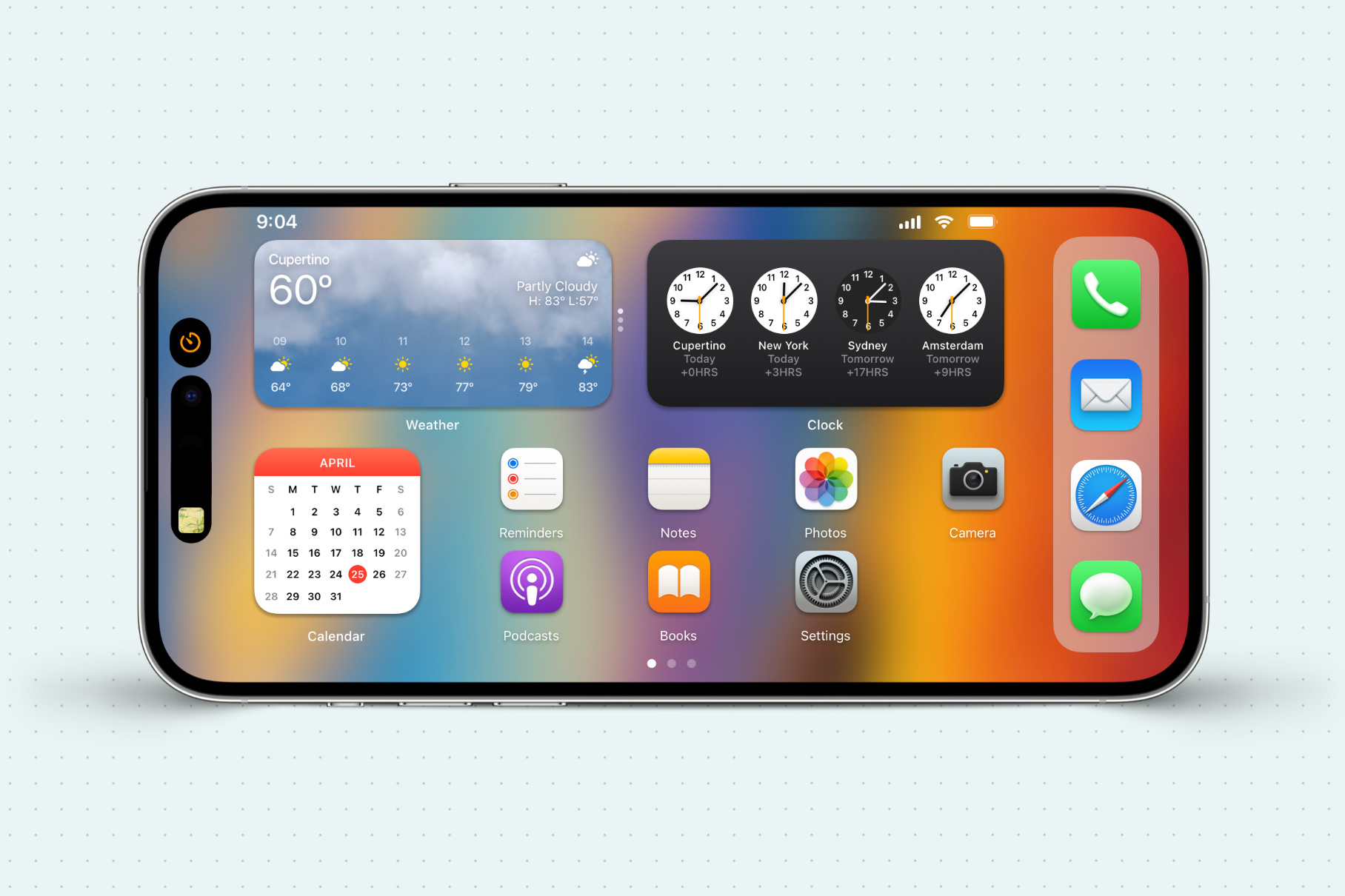
Despite the addition of the notch and Dynamic Island, the concept shows that a landscape iPhone Home Screen is still possible, with widgets and app icons coexisting on the same screen as they do in portrait orientation. And although I had to shrink the size of the icons a bit, they remain comfortably large enough to select without issue.
Dynamic Island
Live Activities inside the Dynamic Island have been cleverly tweaked to allow for easy operation when the iPhone is held in Landscape Mode.
The second image shows a modified interface for Live Activities inside the Dynamic Island. The camera is still cleverly obscured in this example, but the platter and controls have been lowered, allowing for easier interaction while in landscape orientation.
Videos & Multitasking
Larger video & true split-screen multitasking comes to iPhone courtesy of Landscape Mode.
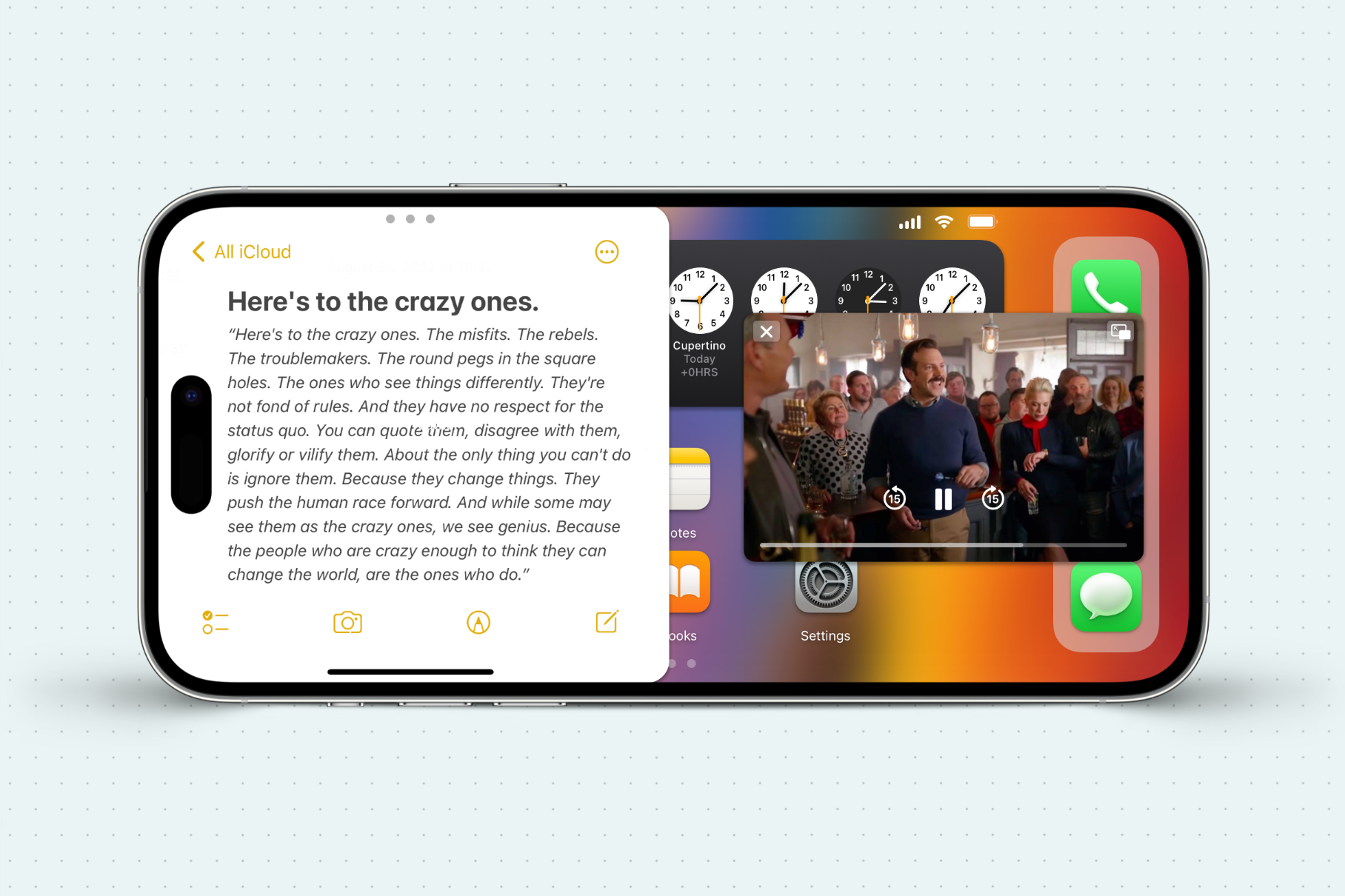
Video overlays and multi-tasking become ideal use cases for a landscape Home Screen. Videos now have greater affordance to expand while maintaining access and interactivity with the Home Screen.
Additionally, since the height of the iPhone is more than double its width, a landscape orientation provides the optimal environment to provide multi-tasking apps side-by-side. Like on the iPad, iPhone apps can be delegated to either the left or right of the display, pushed off to the side, or dismissed altogether. This gives the iPhone more options for lightweight multi-tasking than ever before.
Other Tidbits
Pay no mind to the incorrect April Calendar - that is actually the calendar for August 2022, but I reused it and just covered up the Month because, well, laziness.
The Widgets got a makeover as well. The weather widget shows the current conditions as the widget background, while the clock widget features a Dieter-Rams-inspired face.
Icons were taken from macOS for a more dimensional appearance.
The wallpaper used is from my recent macOS Meets Van Gogh Collection.
In Sum
A mockup is only as good as the new problems it creates, and I'm sure there are many practical and HIG violations this mockup commits that would make a more discerning designer cringe. Nonetheless, this has been a fun little glimpse at what could be possible in resurrecting a landscape Home Screen on iPhone.


