
iOS Icon History
Documenting the evolution of iOS system icons over the past two decades.
With iOS 26, Apple has announced a dramatically new look to their UI: Liquid Glass. Solid material icon elements give way to softer, shinier, glassier icons. I’ve already been chronicling the evolution of macOS icons, and now I’m expanding that project to include iOS. This collection will continue to grow and evolve with new additions throughout the autumn. Enjoy!
Note 01: Beta icons won’t be included. Occasionally, an icon may receive slight design tweaks during the beta cycle, but these temporary variations won’t be part of the collection.
Note 02: Believe it or not there was a day before retina display, and the early versions of iOS featured low resolution icons. Wherever the design remained identical between standard and Retina, I’ve opted for using the Retina version. But in cases where the icon evolved with the jump to Retina, I’ve done my best to track down and include the original low-resolution version - but keep in mind it’ll be really blurry when upscaled.
Update History
September 08, 2025: Added Weather & Apple Podcasts.
September 14, 2025: Added iPod/Music.
October 14, 2025: Added Camera, Notes.
November 07, 2025: Added GarageBand.
November 13, 2025: Added Apple Store.
November 21, 2025: Added Safari, iBooks/Apple Books, Maps, Compass, Apple TV.
Weather
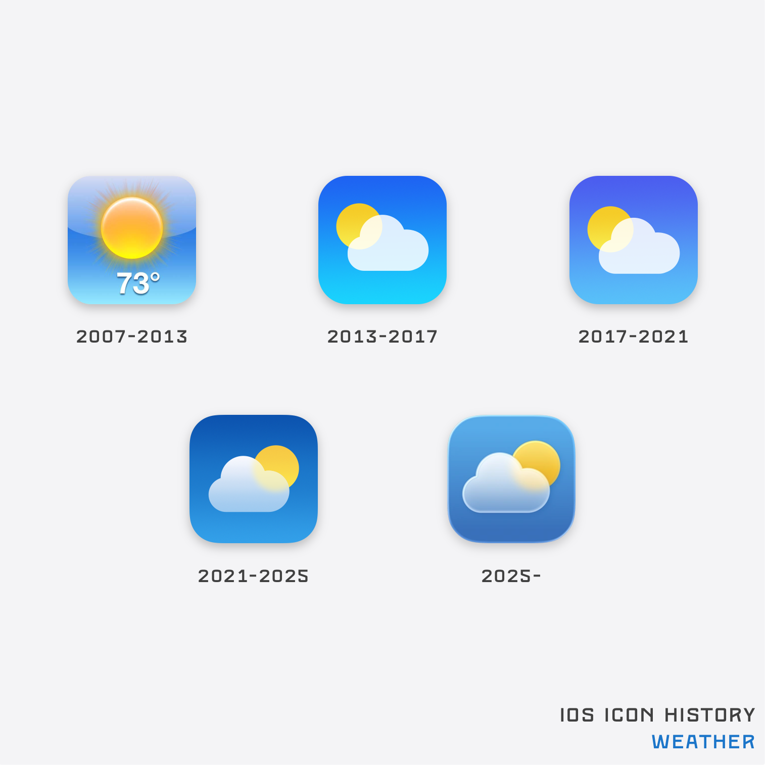
Note: Prior to 2010, Weather used a non-retina class icon. The image used here is the retina class icon that was introduced in 2010. The icon’s design remained the same. The icon used also features the temperature in Fahrenheit, although a separate version using Celsius was shown to people in regions using the centigrade scale.
Apple Podcasts

iPod/Music

Camera
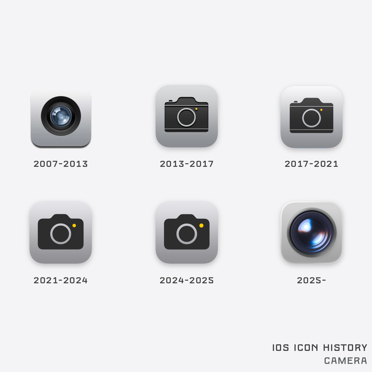
Note: Prior to 2010, Camera used a non-retina class icon. The image used here is the retina class icon that was introduced in 2010. The icon’s design remained the same.
Notes
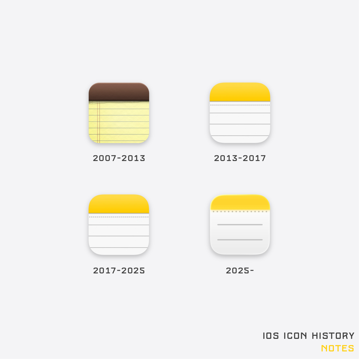
Note: Prior to 2010, Notes used a non-retina class icon. The image used here is the retina class icon that was introduced in 2010. The icon’s design remained the same.
GarageBand

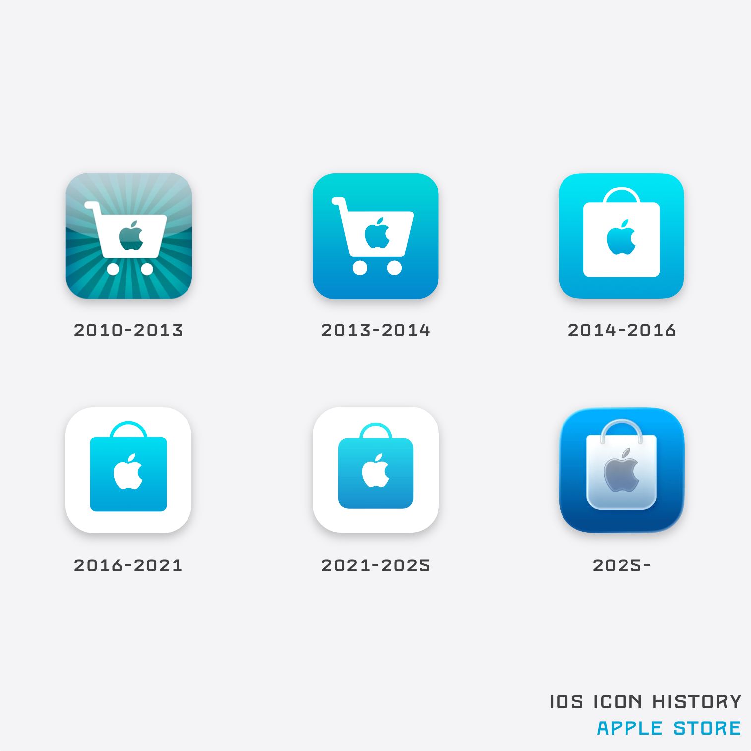
Apple Store
Safari
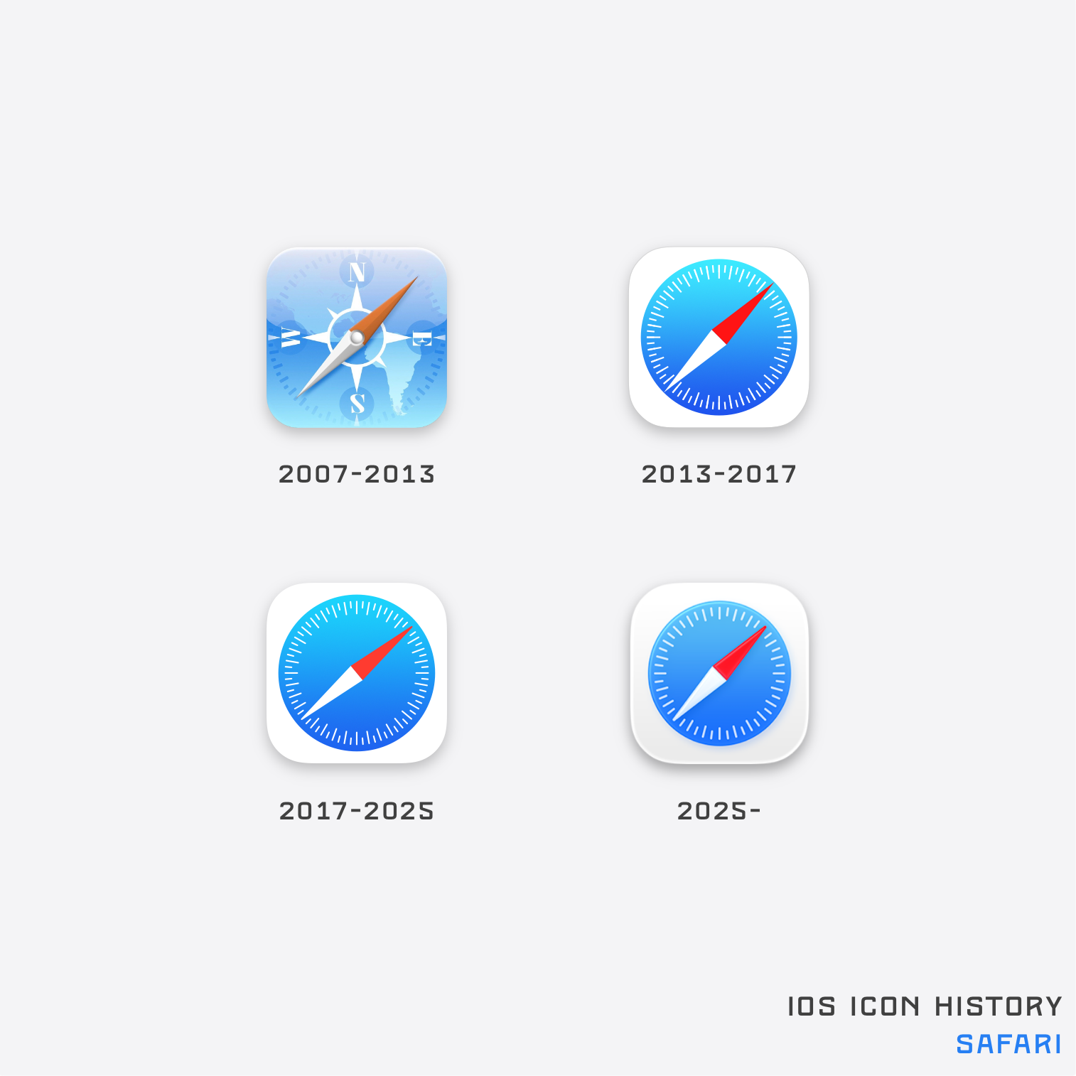
Note: Prior to 2010, Safari used a non-retina class icon. The image used here is the retina class icon that was introduced in 2010. The icon’s design remained the same.
Maps
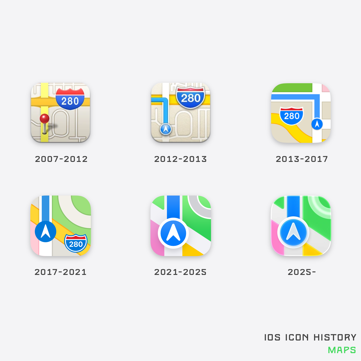
Note: Prior to 2010, Maps used a non-retina class icon. The image used here is the retina class icon that was introduced in 2010. The icon’s design remained the same.
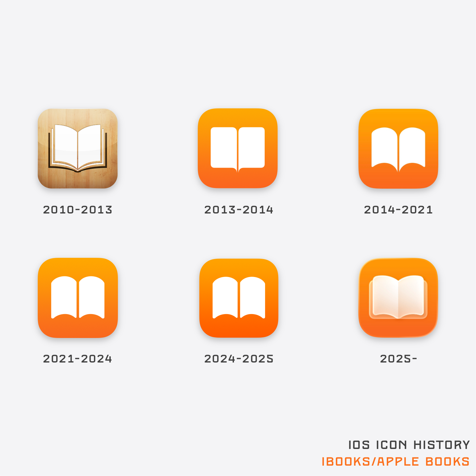
iBooks/Apple Book
Compass
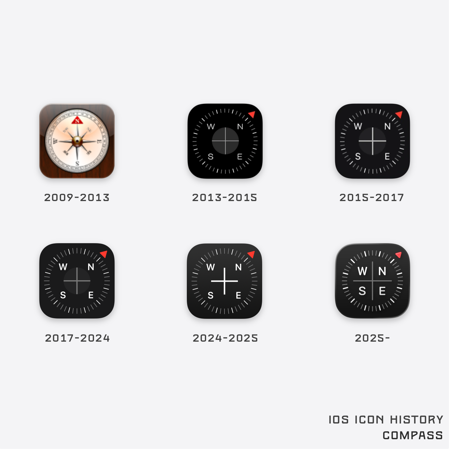
Note: Prior to 2010, Compass used a non-retina class icon. The image used here is the retina class icon that was introduced in 2010. The icon’s design remained the same.
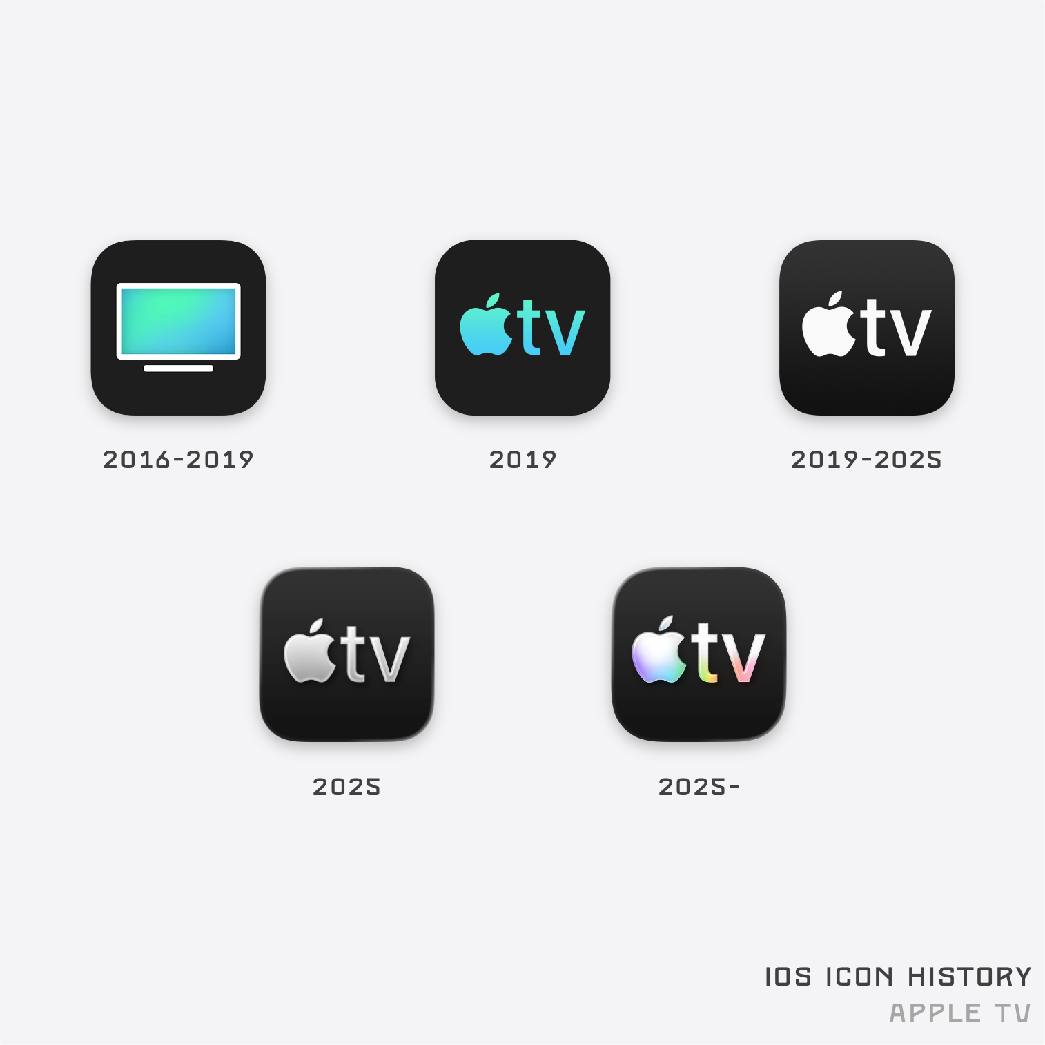
Apple TV
Special thanks to Remo (@remo_Pr0) for providing me with an archive of some older iOS icons used throughout this article.